SPOTLIGHT
Advanced social network analysis.
CONTEXT
Insikt Intelligence is an important player in Social Media mining and Artificial Intelligence powered data analytics on all digital sources.
They develop solutions in order to help detect and combat online crime, including Law Enforcement Training courses, to help police and other interested parties improve and acquire mastery of efficient, powerful techniques for extracting information from large datasets such as social networks, social graphs, large document repositories, and other online sources.
DEFINING THE PROBLEM
The web contains an unlimited amount of data linked to different types of criminal activity, just waiting to be discovered. The Internet’s intelligence potential makes it a must-have resource for all security investigations and analysts.
They need to build a product from scratch: designing the visual identity and a flexible and intuitive platform to access all the data and gain actionable intelligence, fast and accurately.
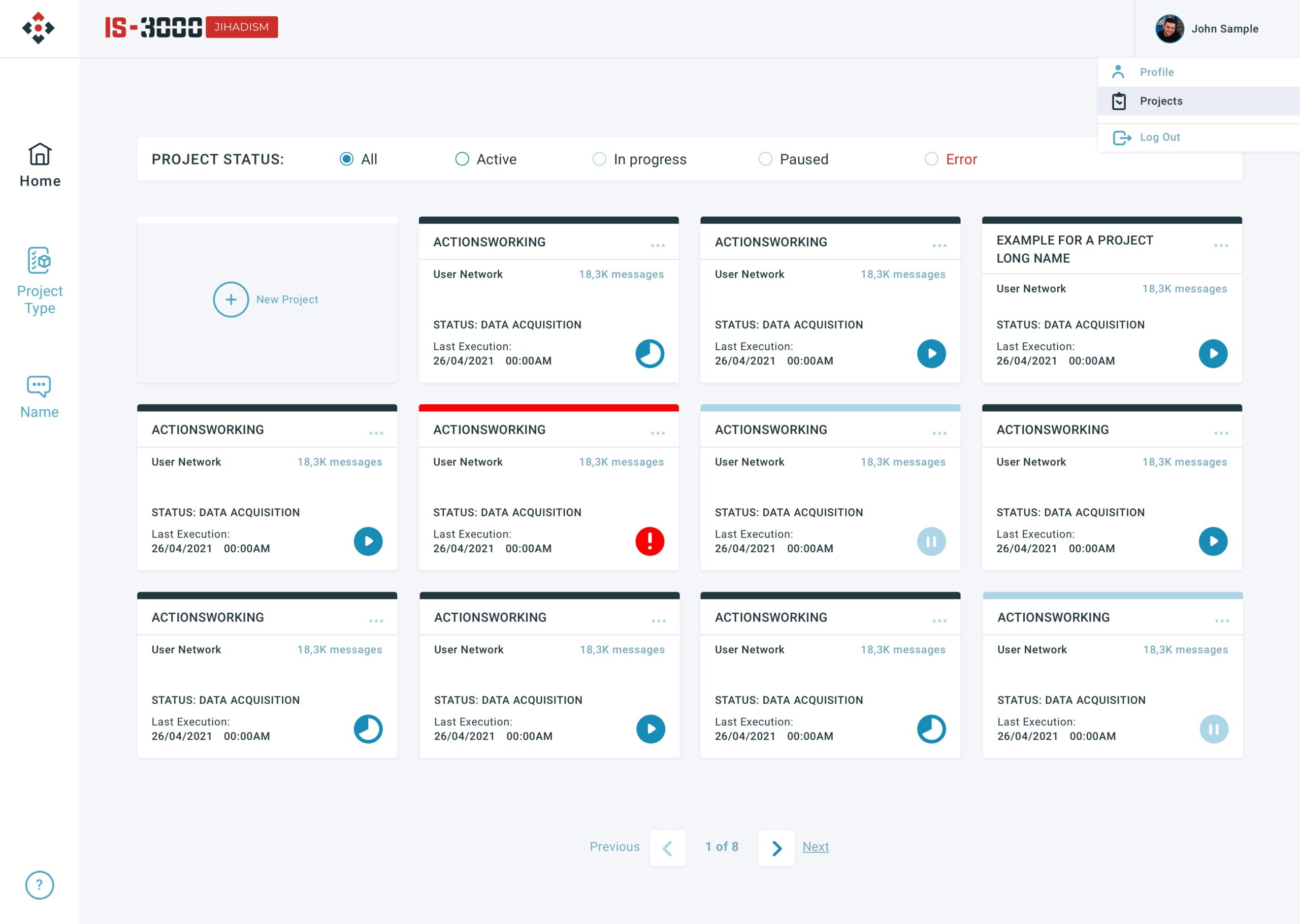
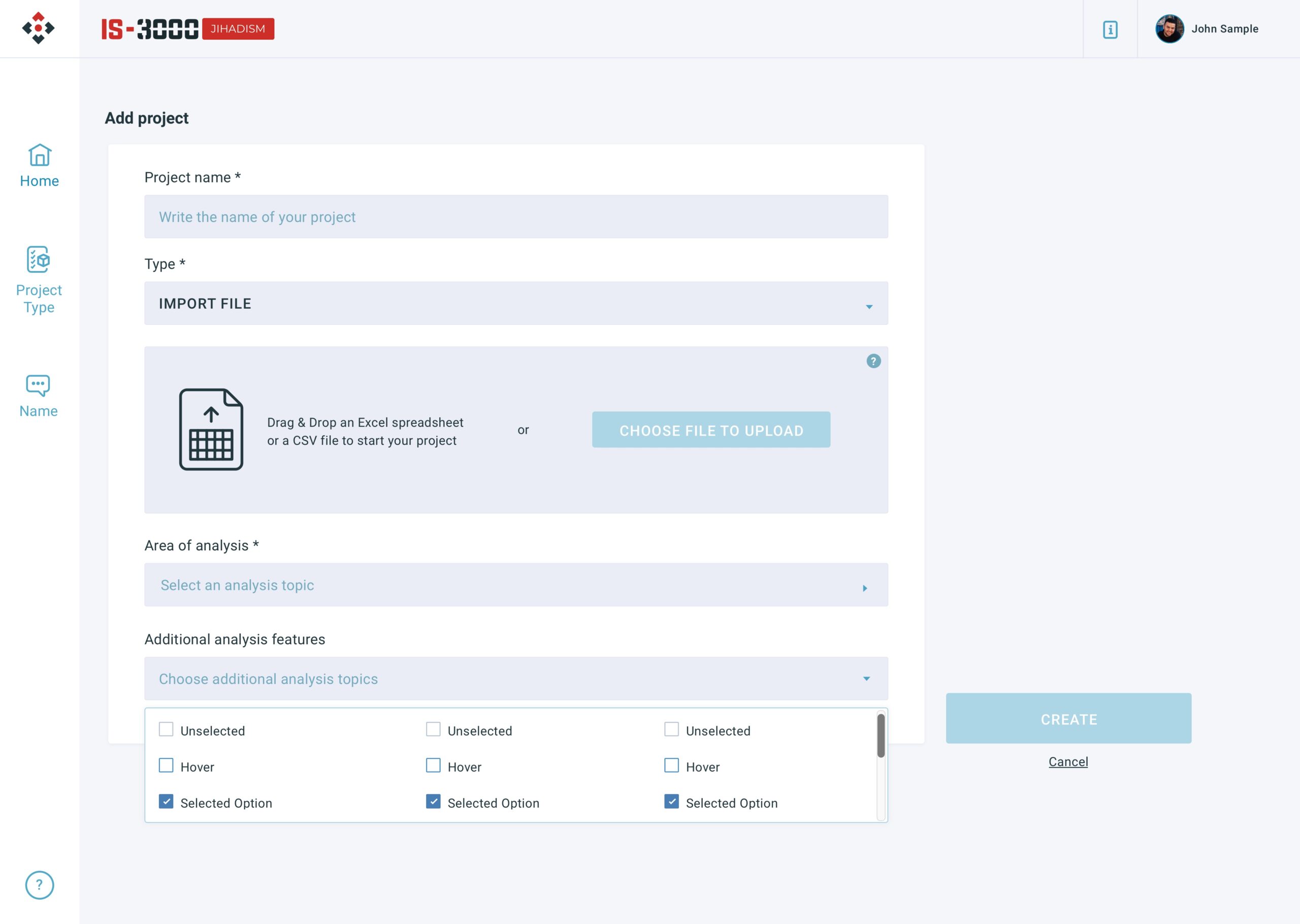
Product need: Cards of the overview project section must show a lot of important data regarding project status, execution date, project info and a visual way of showing if the project is ready or not.
Design decision: Building an icon that shows the status of the project, provides a visual attraction point, in addition, the use of semantic and gradient colors reinforces at a glance the information about what is happening in each project.
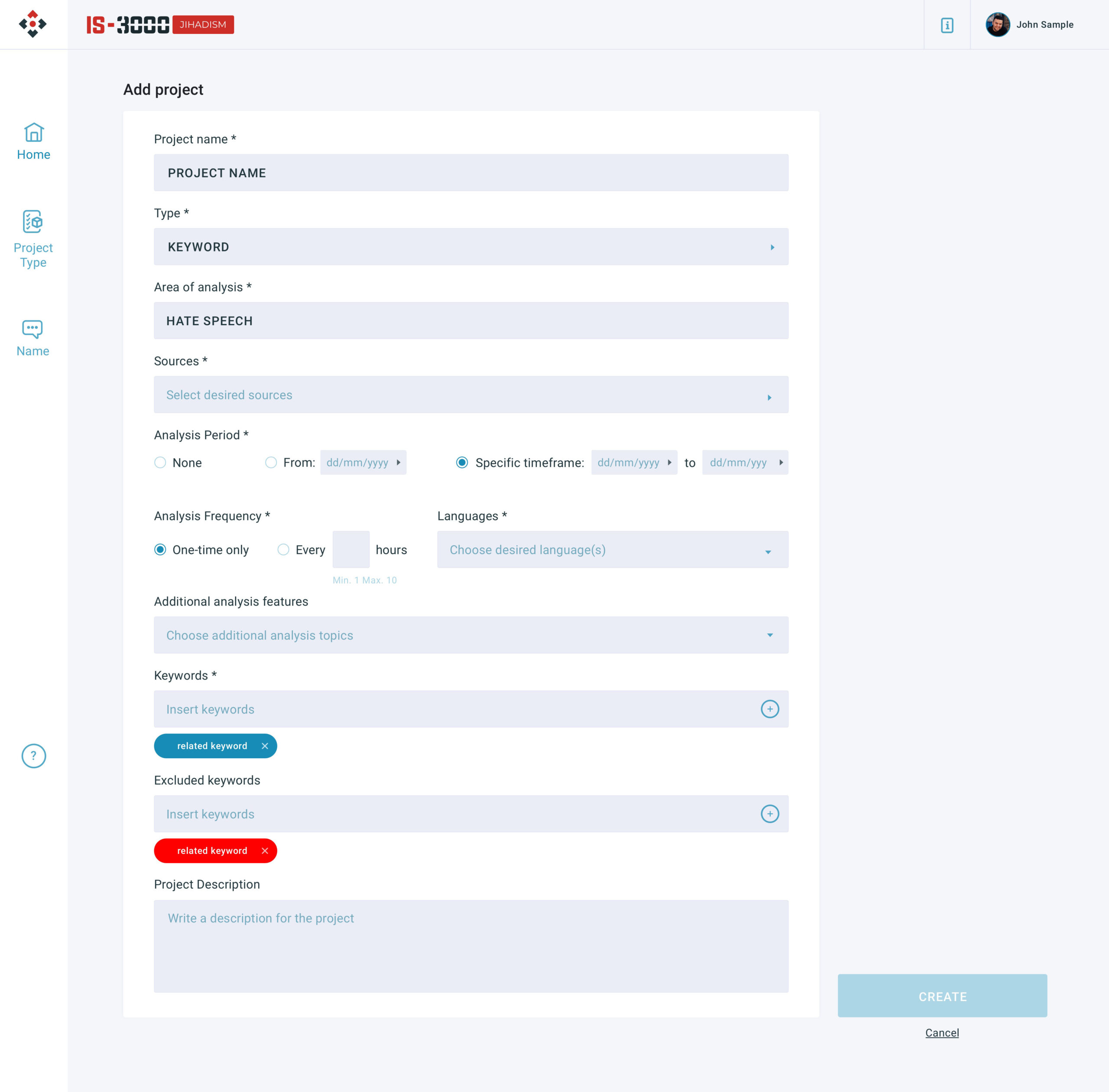
PROJECT CREATION
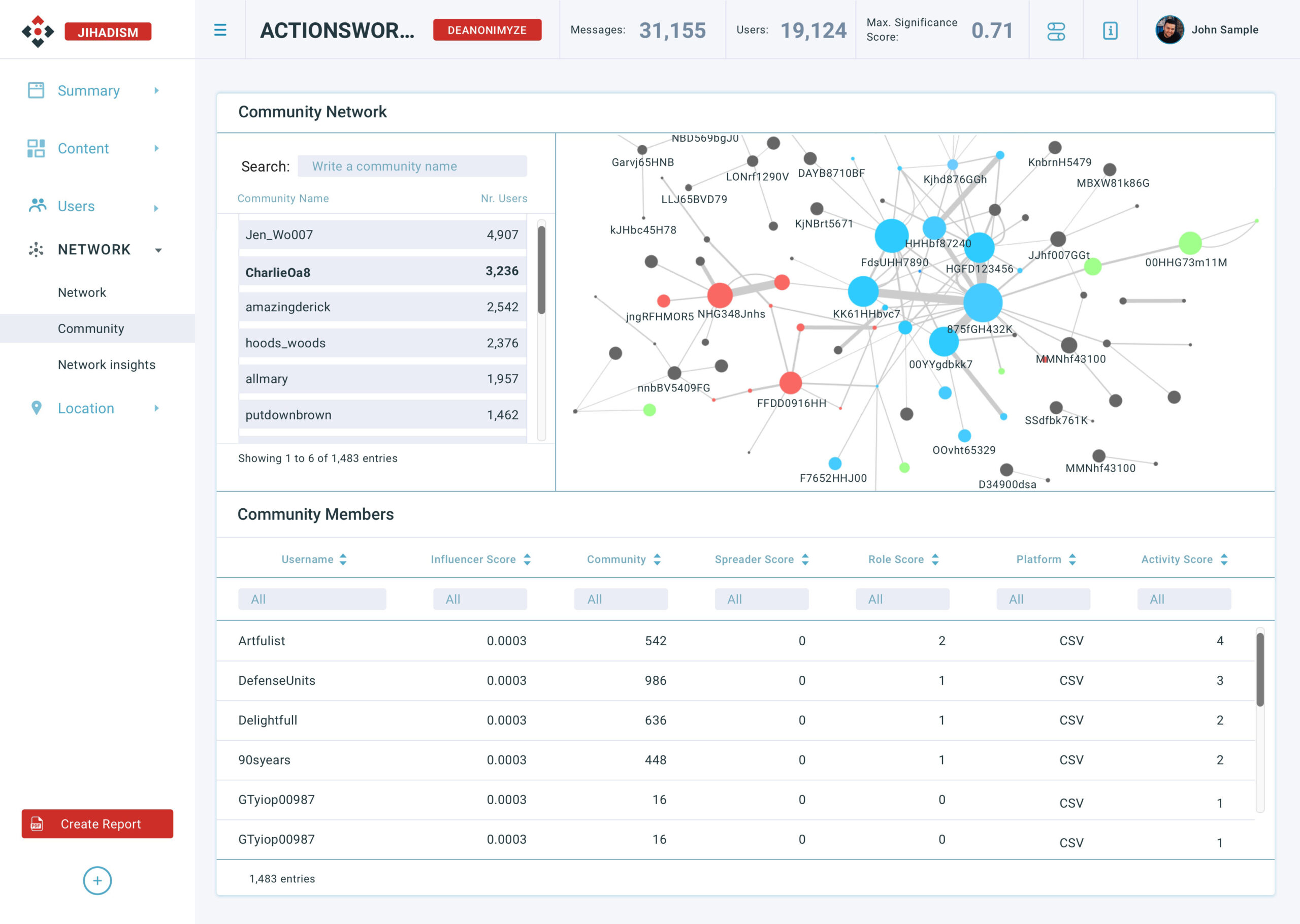
DATA VISUALIZATION
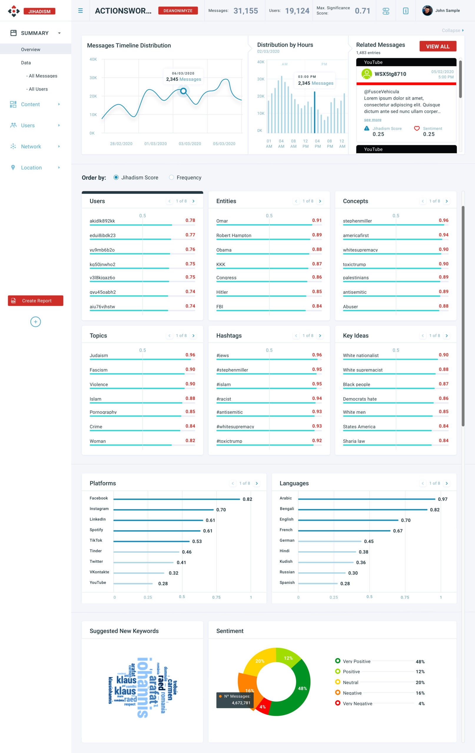
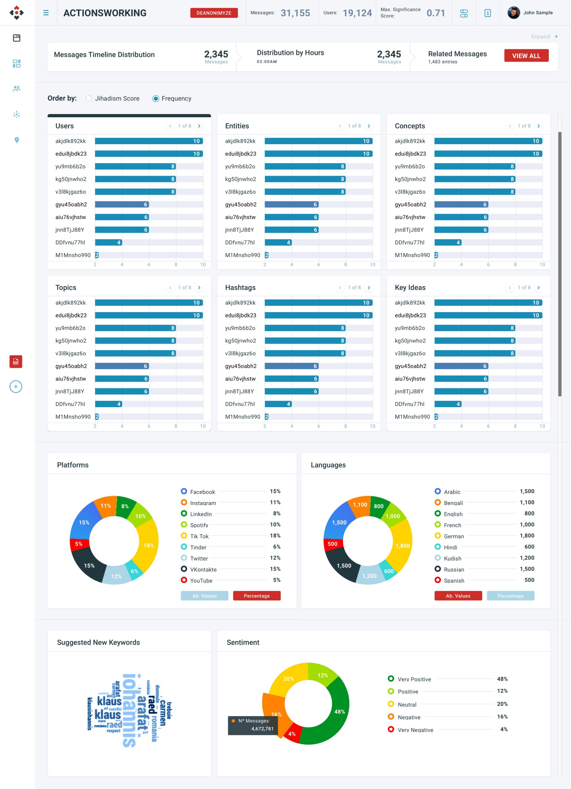
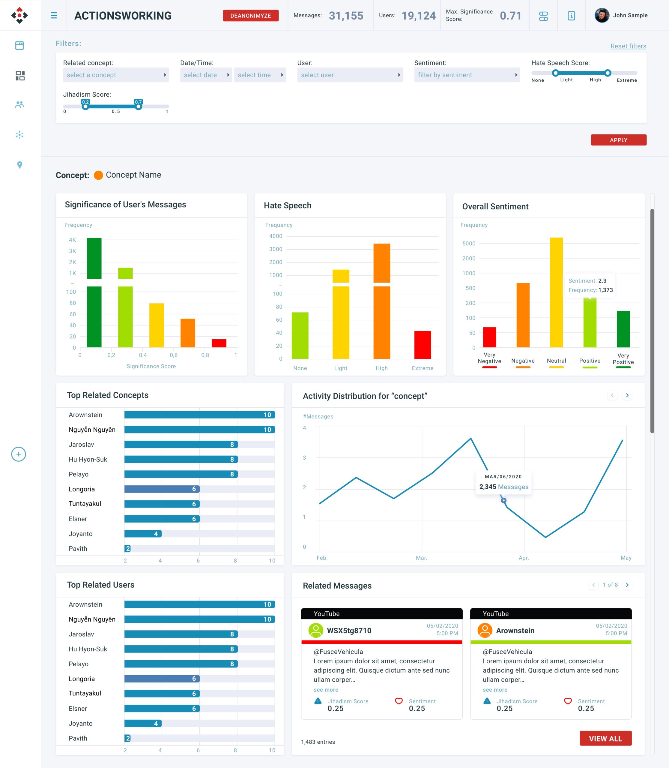
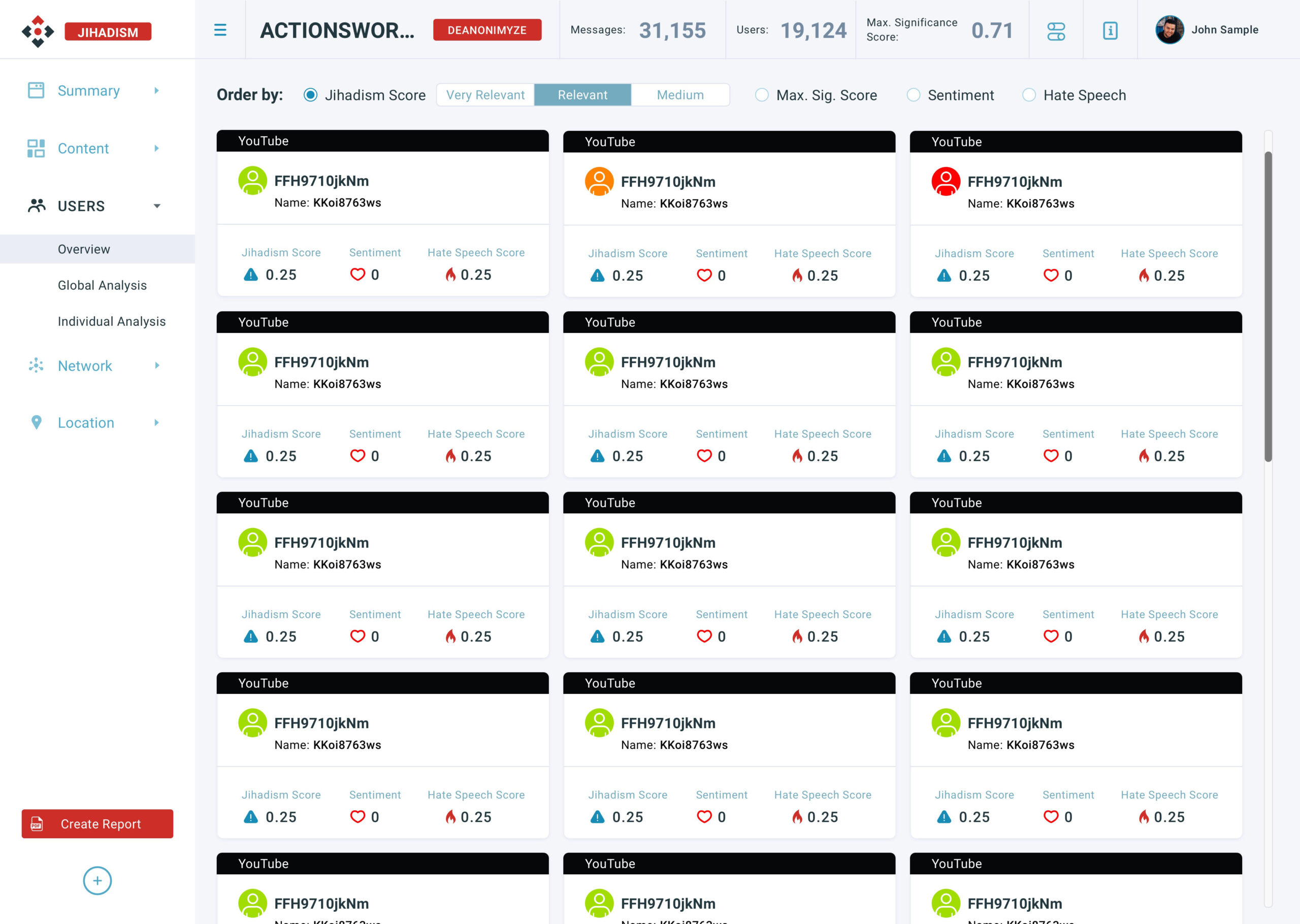
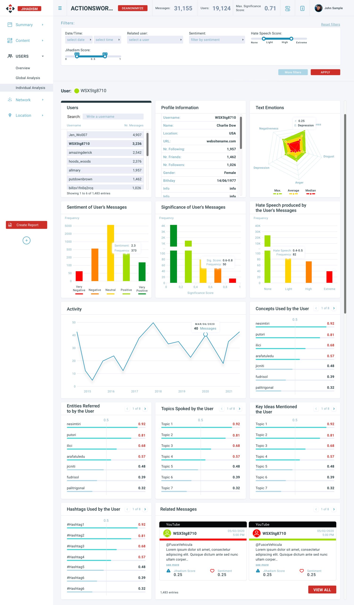
Design Decision: Collapsing the lateral menu gives more space to the data visualization, especially on small screens such as tablets. On the other hand, the first row of graphs serves to segment the information from the rest of the charts and collapsing it helps not only to gain space but also to focus on the resulting data.
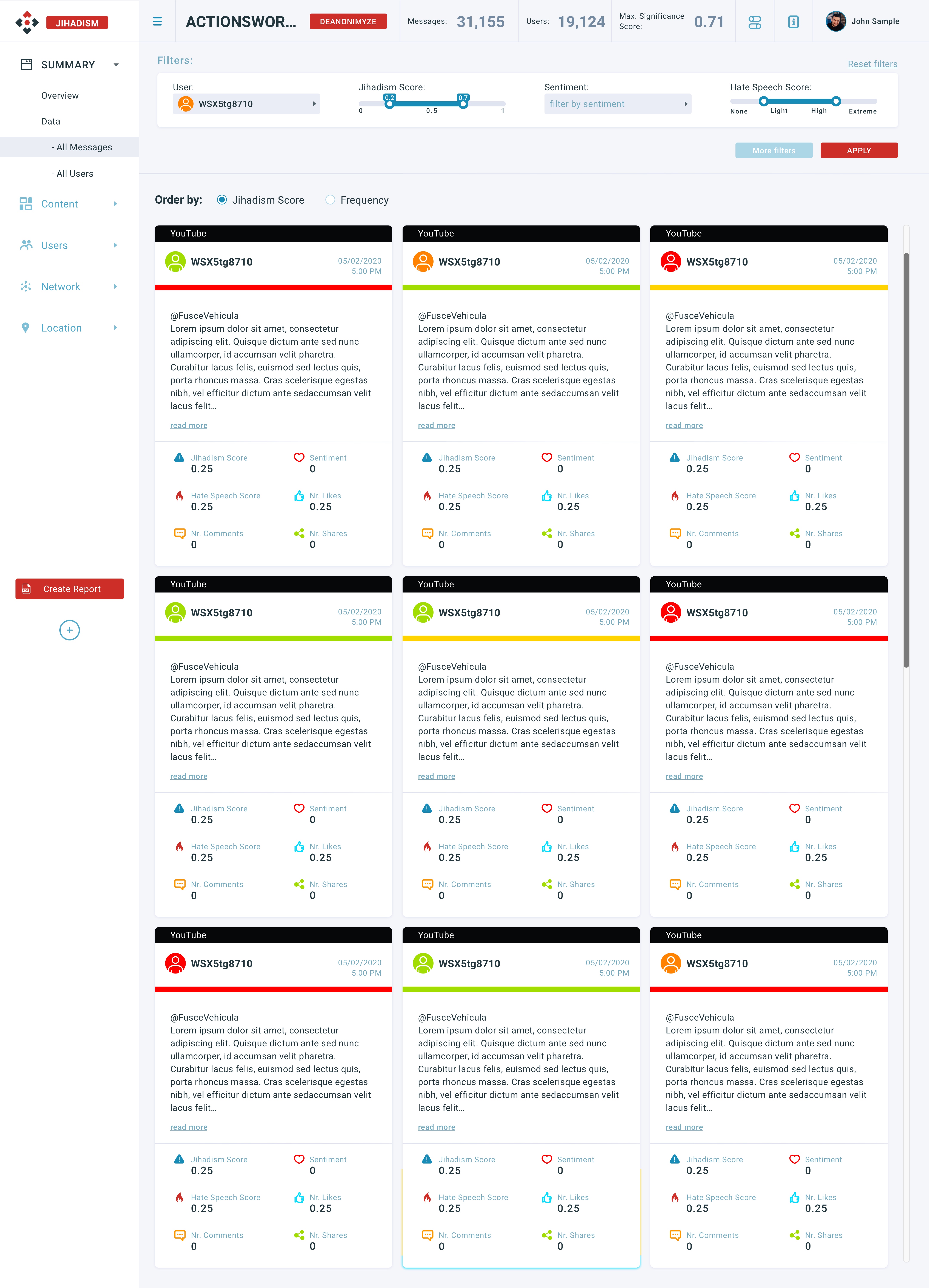
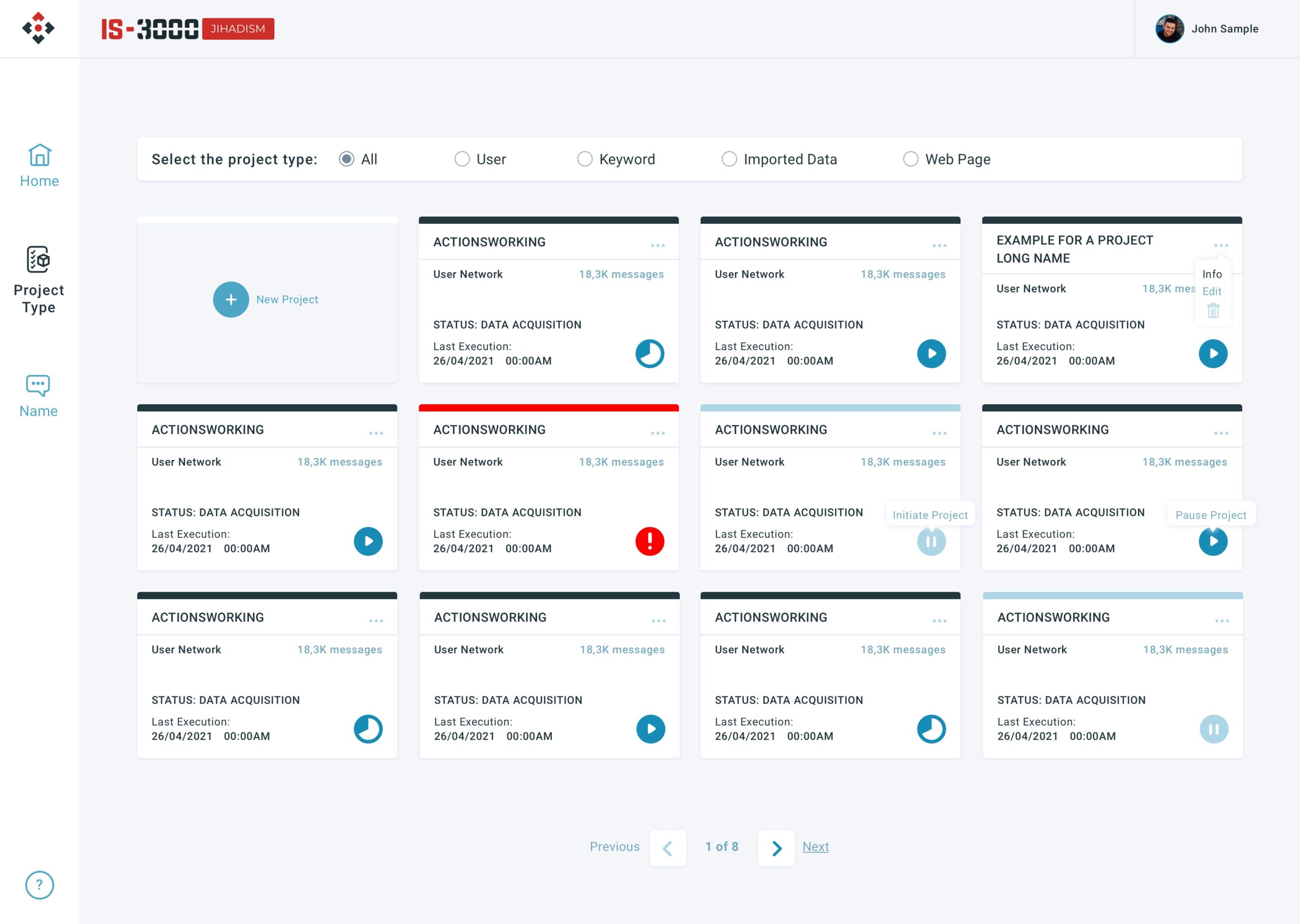
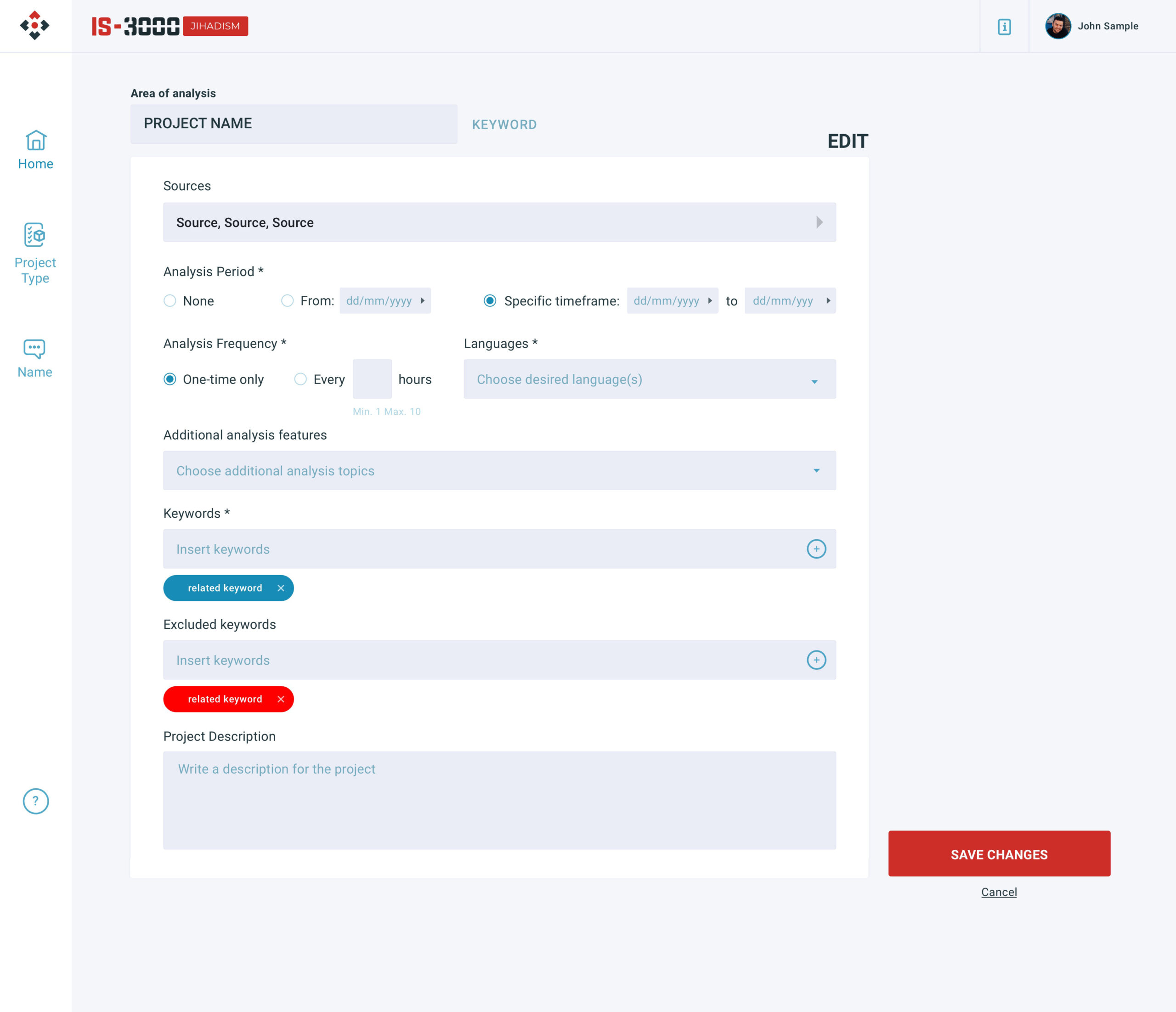
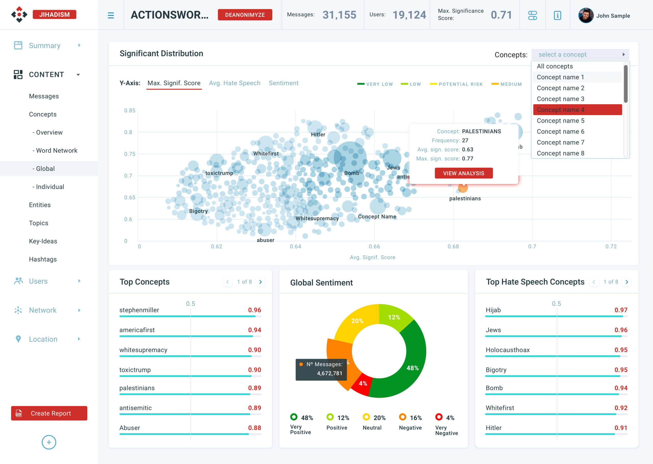
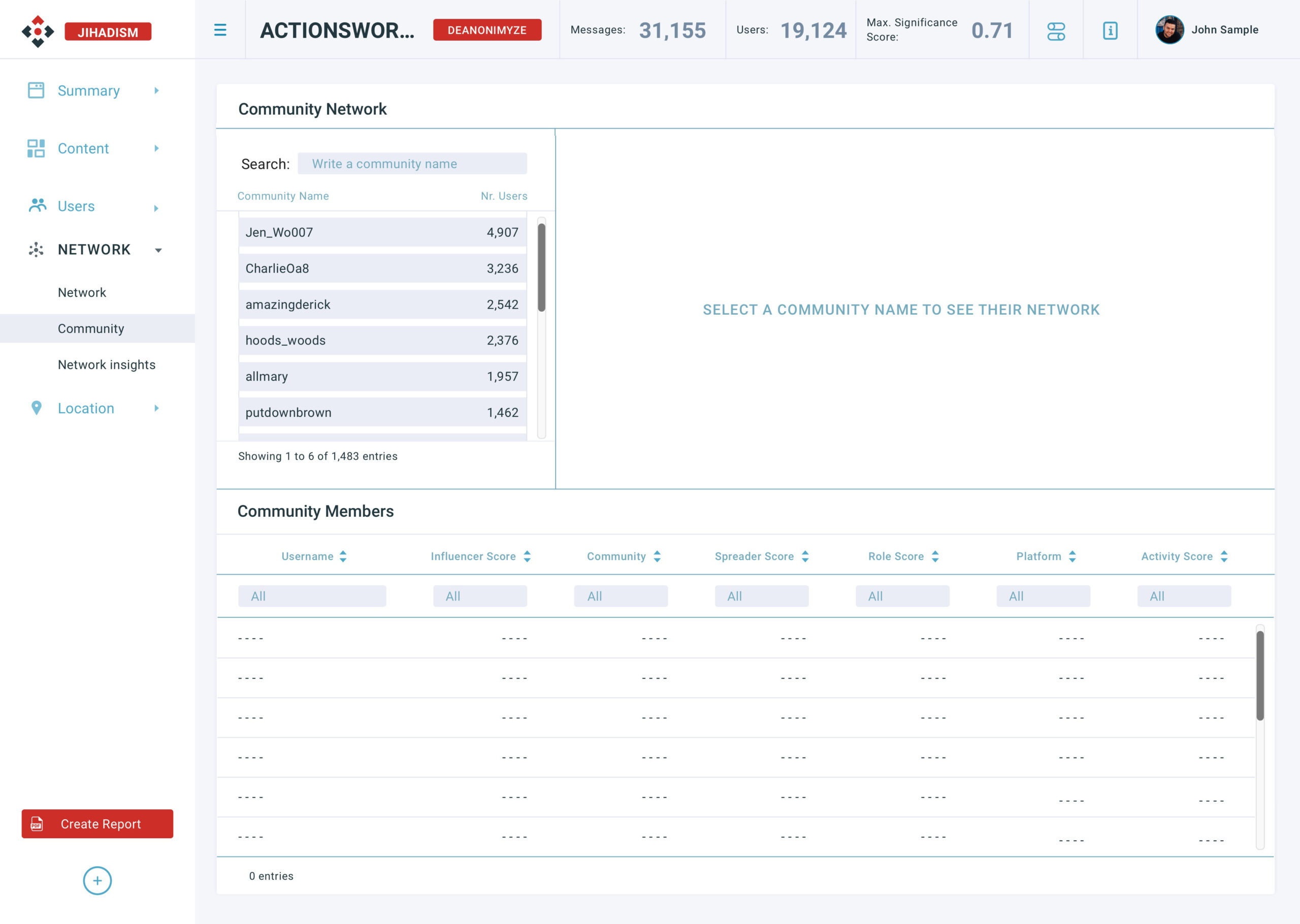
Design Decision: Filters need to appear on some pages, so they needed to have the same size to make them modular. Continuing with the need of saving space, I split the filters box into "basic" and "more" depending on how much are every filter used.
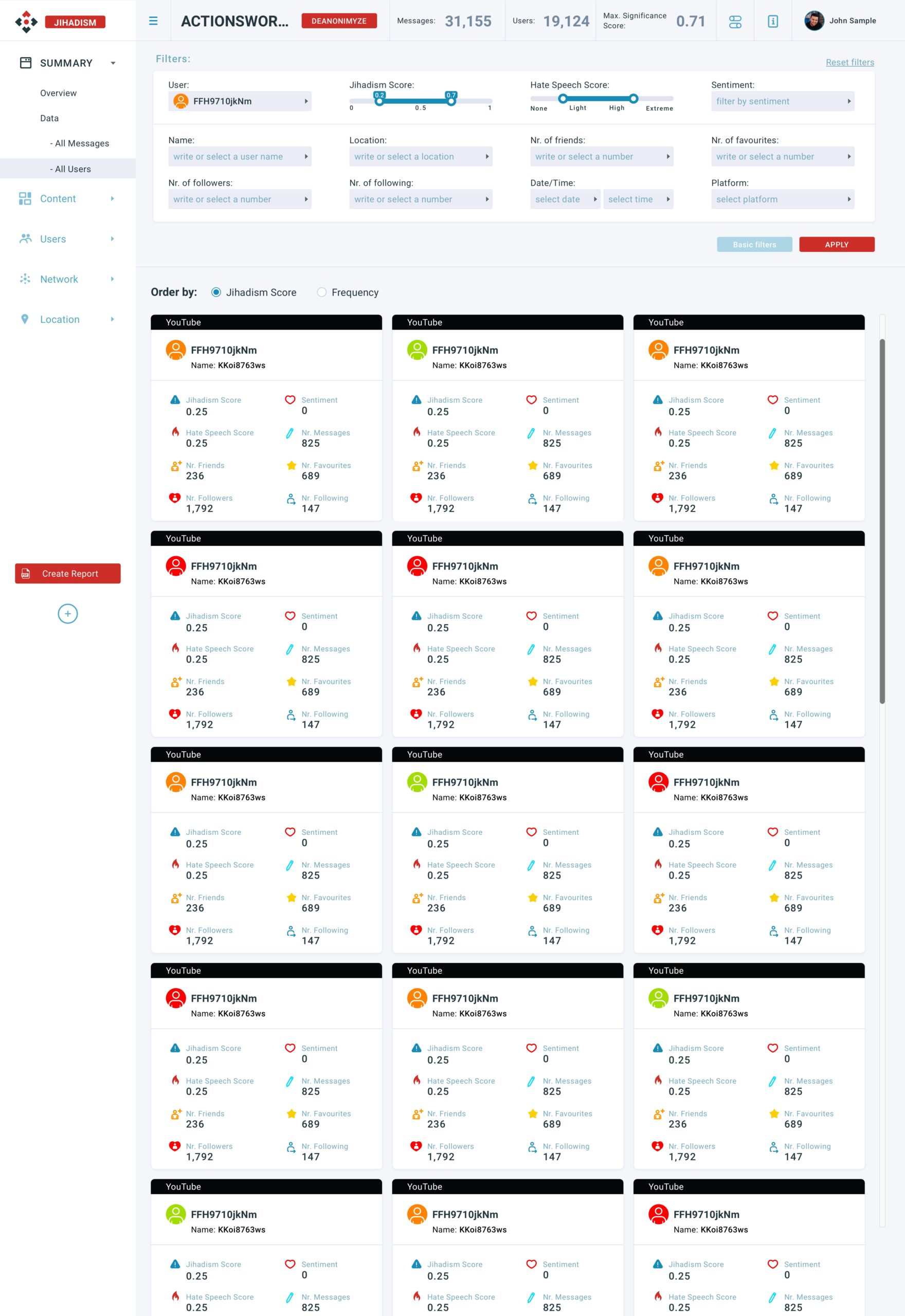
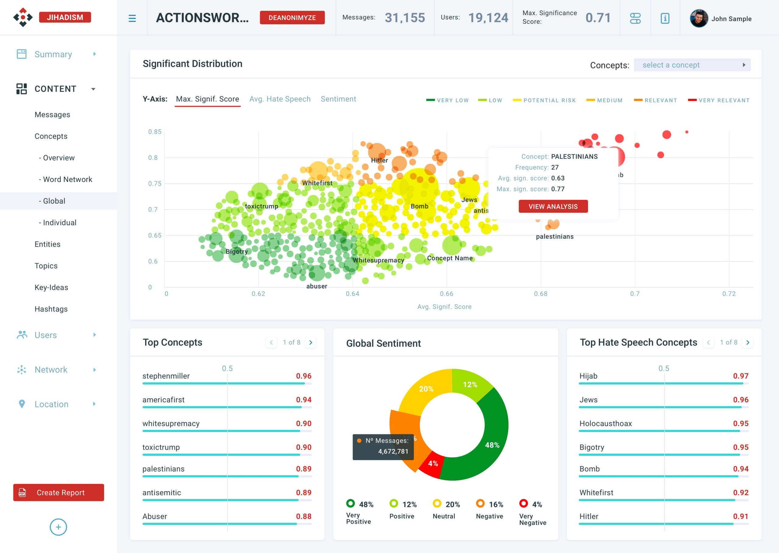
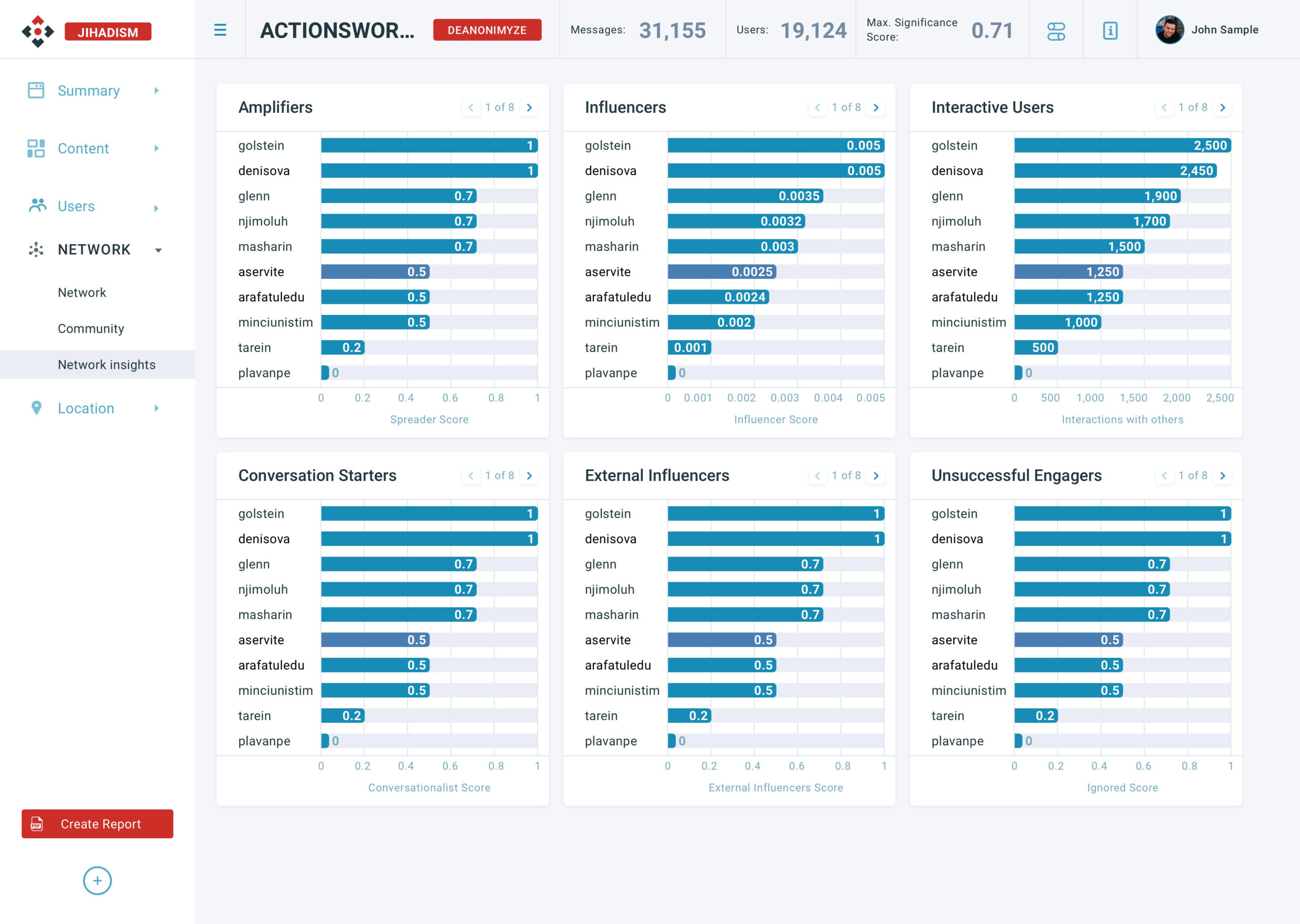
"Message" and "Users" cards needed to show how "dangerous" every message and user is, so I used semantic colors to indicate the level and make them easy and quick to identify: a line for messages and a colored icon for users.

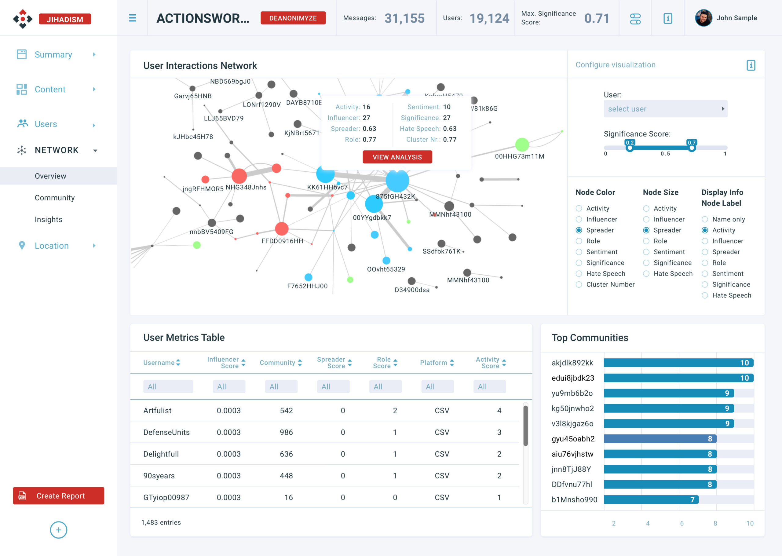
Design Decisions: I placed in the first row of every page the common information every project has: relevant numbers, general project filters button, and profile information and access. They all need to be separated from the data and have to be always accessible, it gives context to users and allows them to access general features.
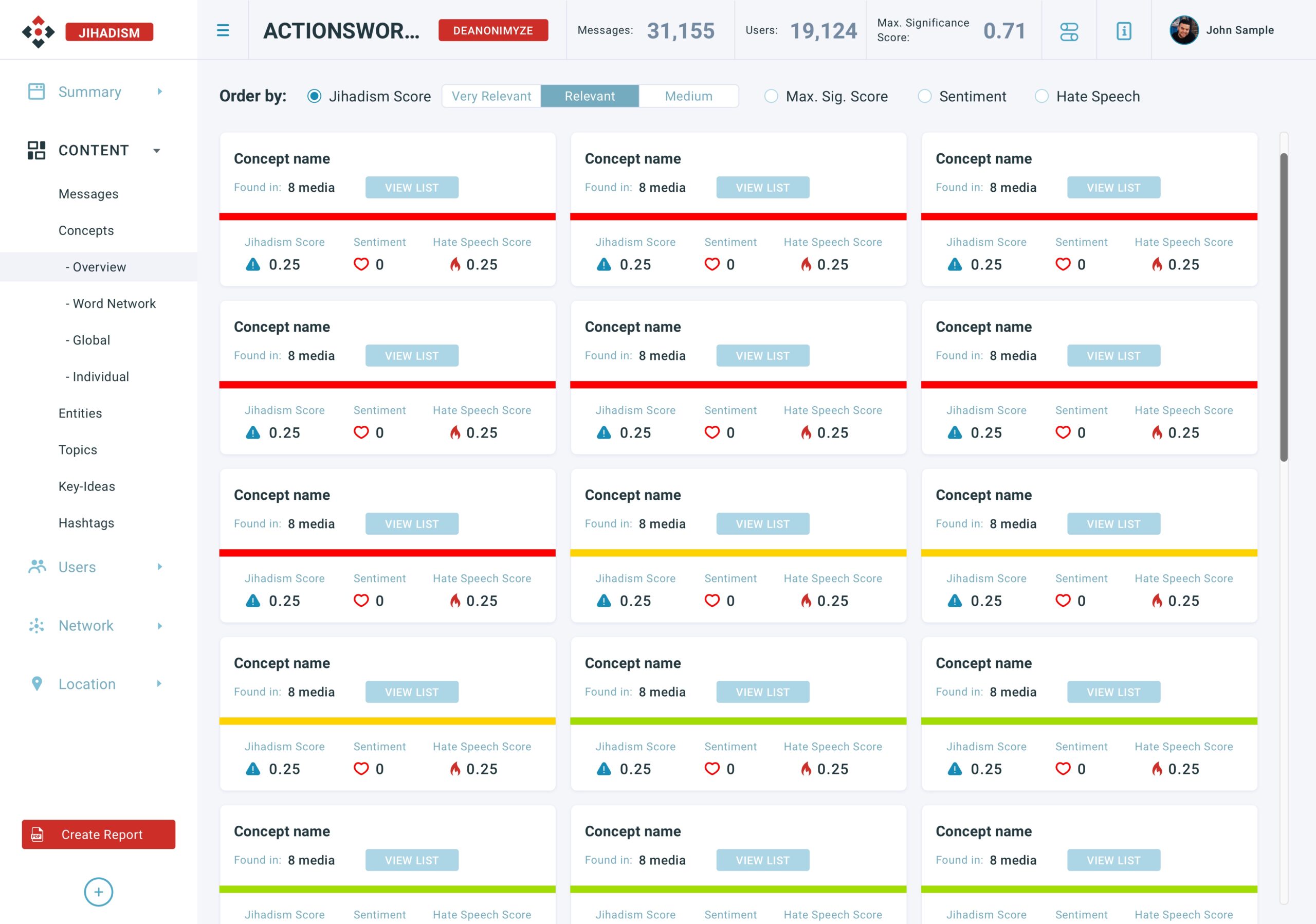
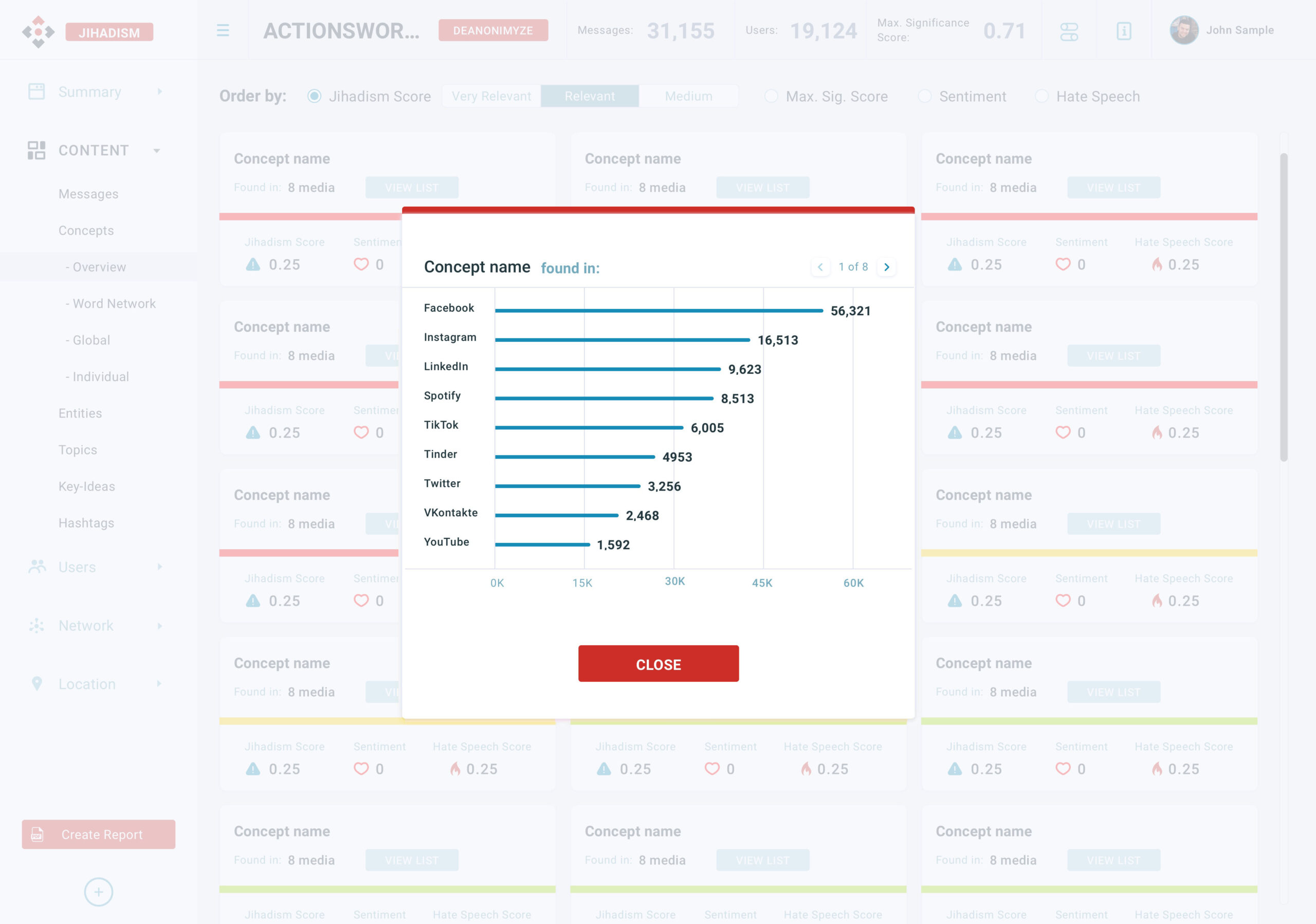
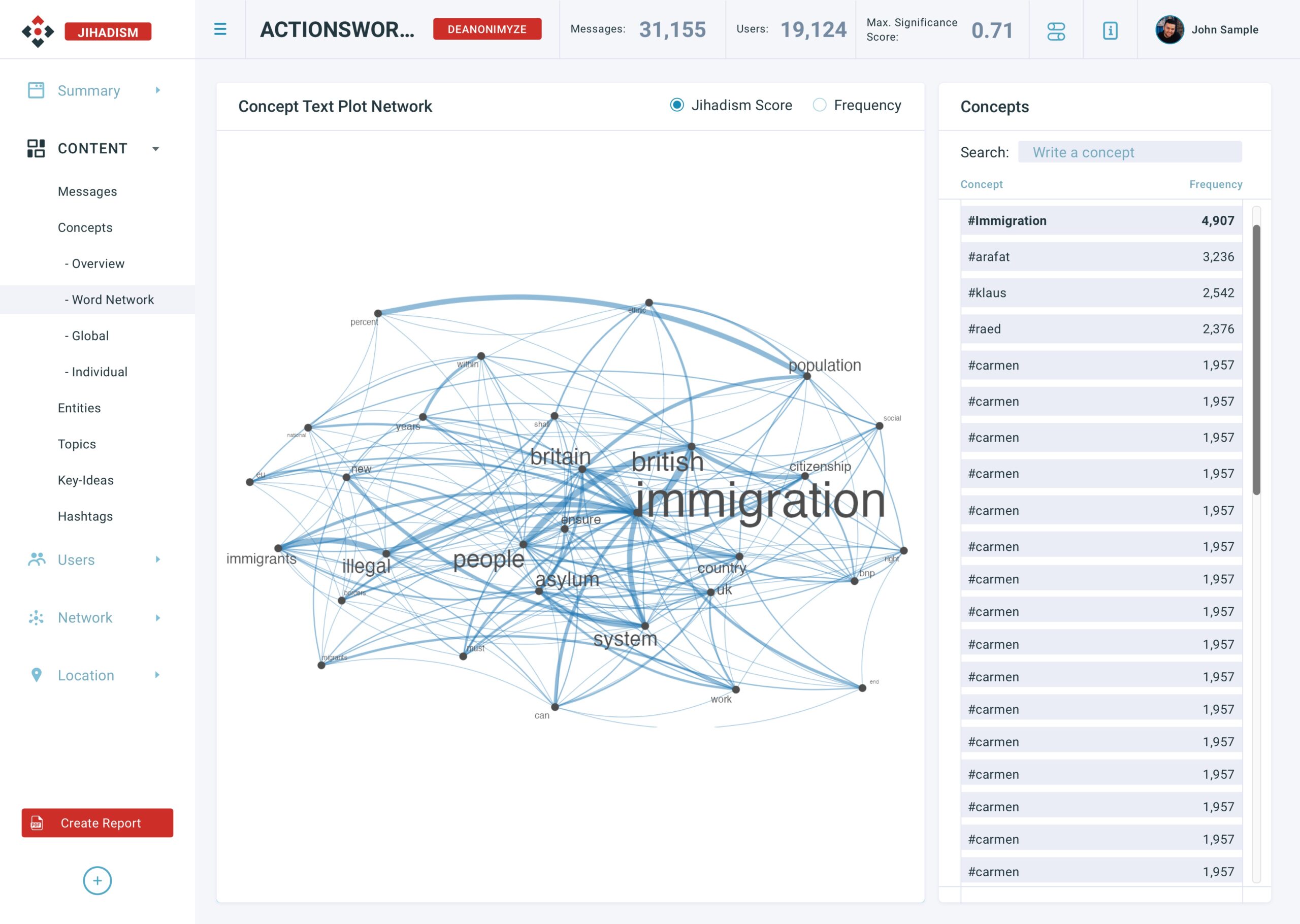
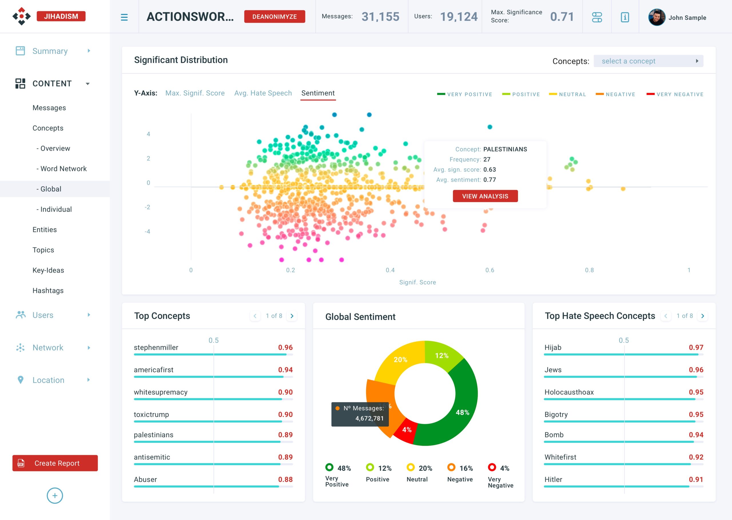
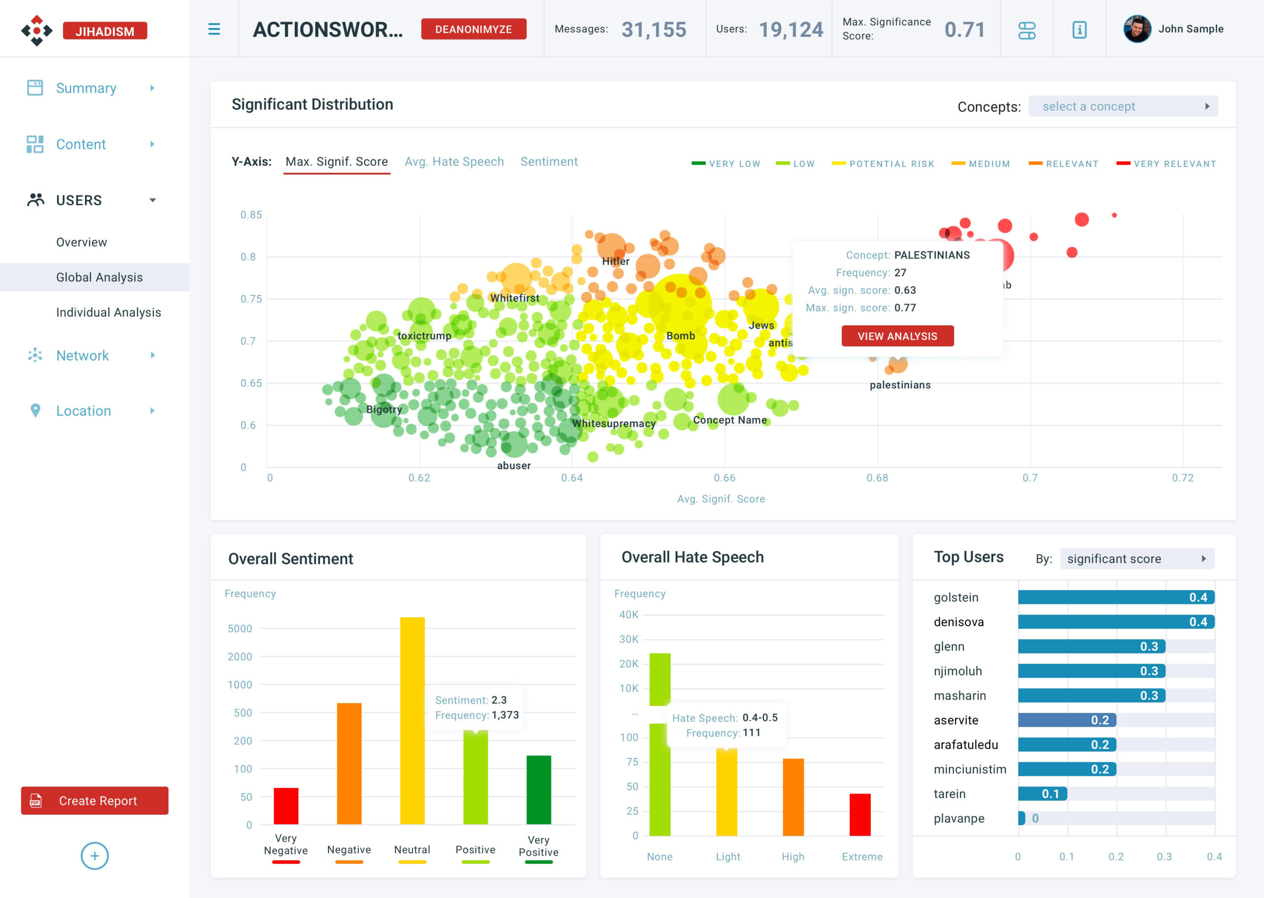
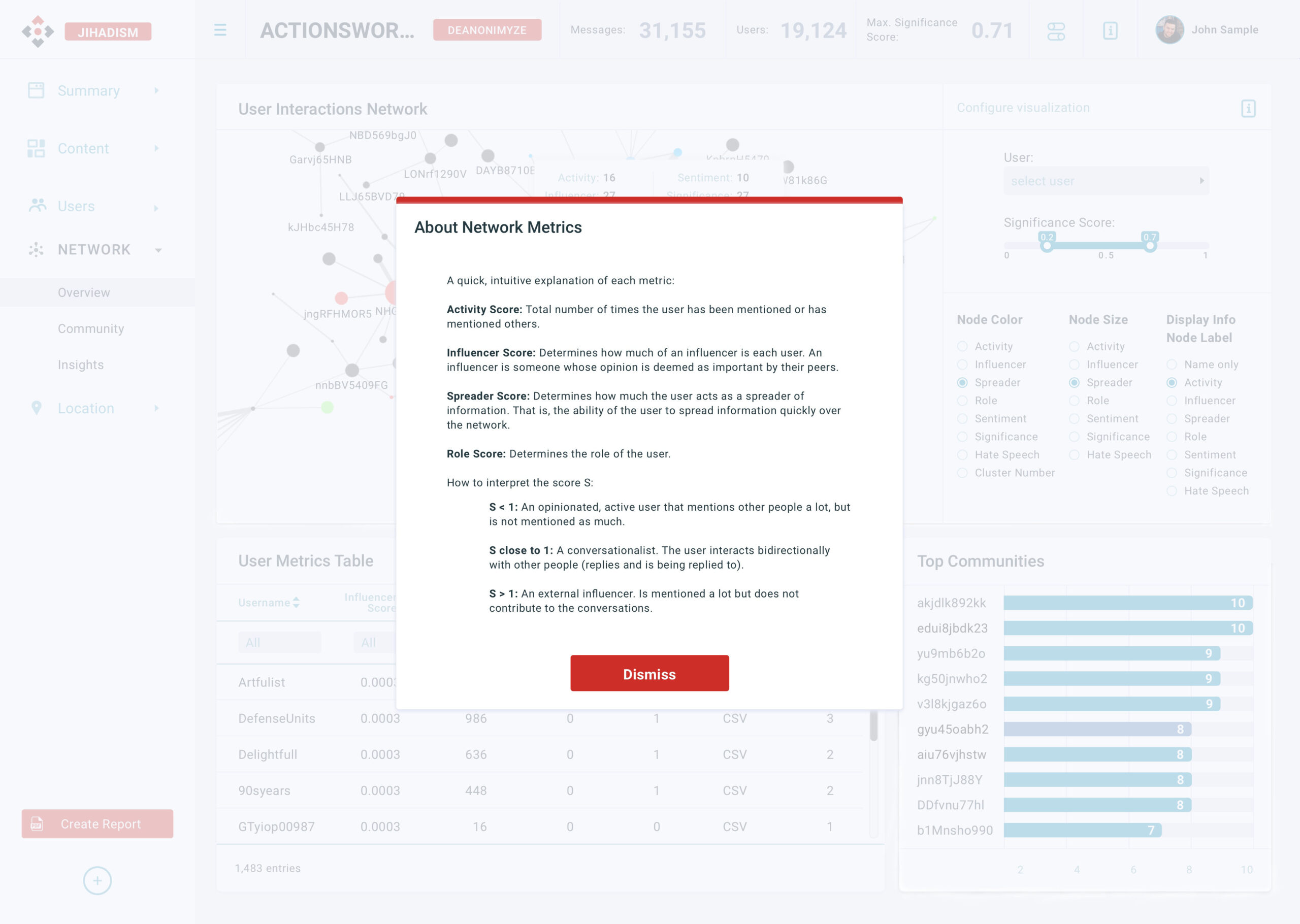
In the whole dashboard, there are two general sections. They refer to specific data and have to be easy to identify which is which. That's why I used two designs of horizontal bars charts: the blue thin lines and the blue thick lines. The semantic colored charts are common in both sections and need to have a different visual treatment to show different levels of sentiment in an easy way.
I decided to narrow the color palette to the five semantic colors –red, orange, yellow, light green, and dark green– for the charts that need to show some level of sentiment, and four gradients of blue for the rest of the data visualization to make all them consistent.
LEARNINGS
Not all people understand data visualization in the same way. Knowing your user's interests is key to design a solution that fits in user's needs.
Data visualization design is like another world in the product design universe. If having close contact with stakeholders is important, data visualization design is the key to success. Nobody, but the user, helped me more to understand the particulars of each need.
- Design decisions are as important as business decisions. They both need to go hand to hand to build a solid and user-centered product.
Selected Works

BingeProduct Design

Softonic Corp SiteProduct Design
LETRSProduct Design
PrimarkProduct Design
SPOTLIGHTProduct Design

New Softonic BrandProduct Design
LogosProject type