DESIGNING A NEW VALUE PROPOSITION FOR BINGERS
Binge.co
Cross-recommendation service among streaming platforms.
CONTEXT
BINGE.co is a desktop solution to the growing streaming industry. The platform offers a cross recommendation service among streaming platforms where users can discover, watch, and build a personalized profile with movies and tv shows. Binge also offers related content such as articles and lists to a complete experience for bingers.
Our business development team detected that there is an opportunity in the growing streaming market. The company decided that was worth developing a product with special content for bingers due to the high % of users interested in movies and tv shows.
RESEARCH AND UNDERSTANDING
We formed a small squad of 5 people to conduct research with a goal: Define a valuable product for bingers and design an MVP to test the feasibility of investing or not in this market.
We started the research by learning about the streaming market benchmarking competitors and other streaming sites and understanding the basic bingers’ segments: Casual Bingers, Core Bingers, and Hardcore Bingers; but we knew that we needed to go further. With this in mind, we designed a survey to build the bingers’ user personas. We conducted a survey about streaming in Softonic and social media to reach the highest possible conversion. It was the first great insight; Softonic users really want a product for bingers. Immediately we detected the most significant insights:
- Users need to remember in which platform is each series they are watching.
- It is time-wasting to look for a new movie or series that fits the user’s interests aka The Netflix Syndrome.
- The recommendation system rarely works.
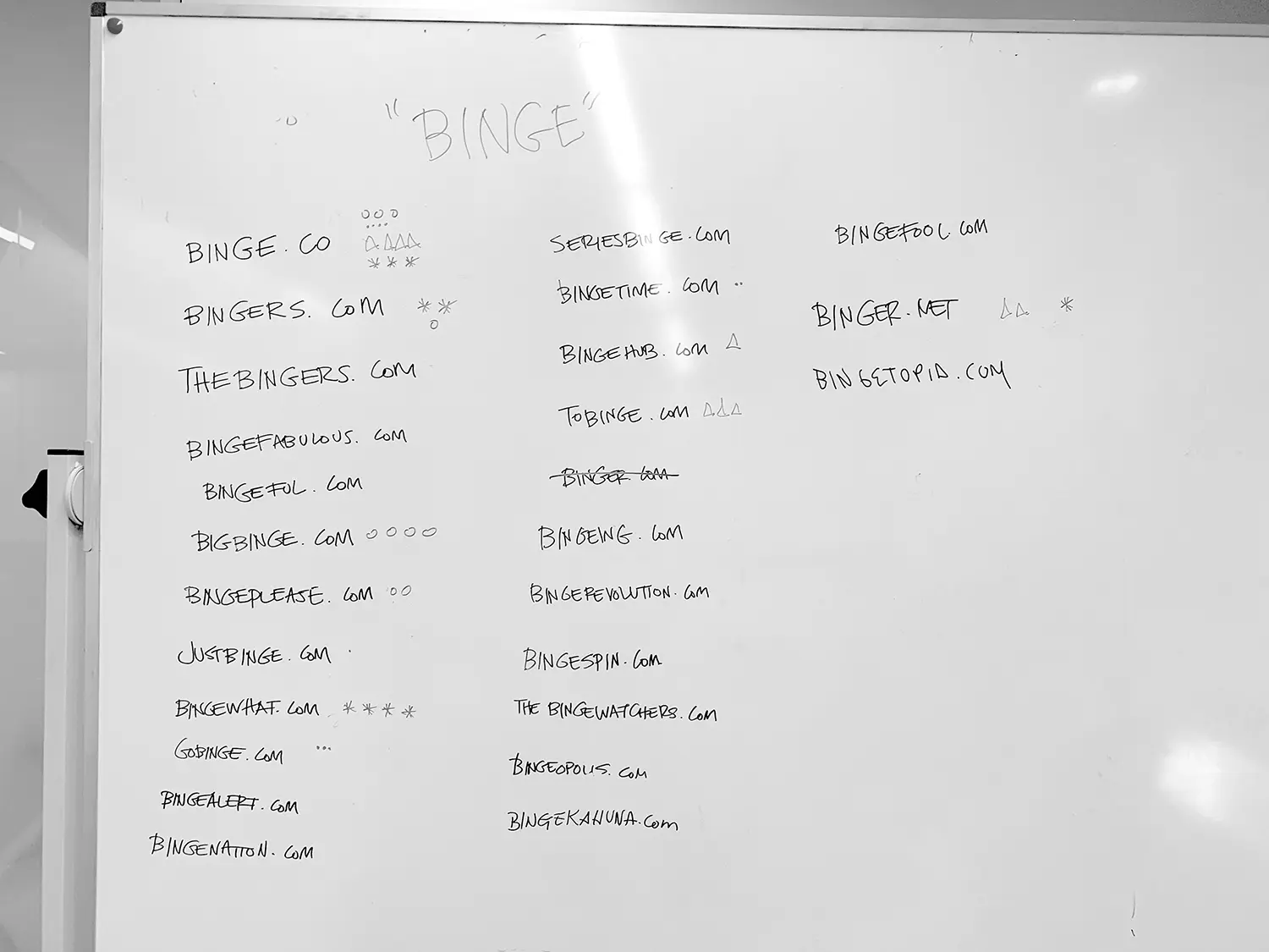
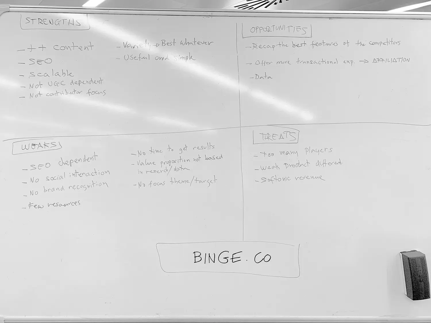
DESIGNING THE VALUE PROPOSITION
In order to design the value proposition, we used the methodology proposed by Alexander Osterwalder in the book Value Proposition Design: How to Create Products and Services Customers Want. Through focus groups, brainstorming sessions, surveys, and co-creation sessions we identified the main Customer Jobs and Pains & Gains.
“INVOLVING USERS IN EVERY SESSION WAS OUR MAIN REQUIREMENT”
Finally, we detected an opportunity: help our users to easily find the contact that fits better with their interests by the value proposition: Build a cross recommendation service among streaming platforms.
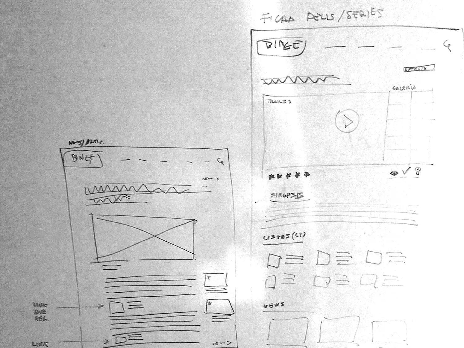
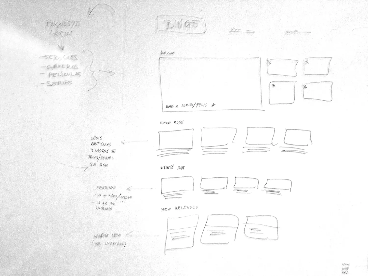
We decided to perform co-creation workshops using the Group sketching methodology: a quick, fast, and economic tool for developing and explaining ideas simultaneously. We imagined digital products that could fill the defined value proposition: Low-level wireframing, site navigation, feature mapping, etc
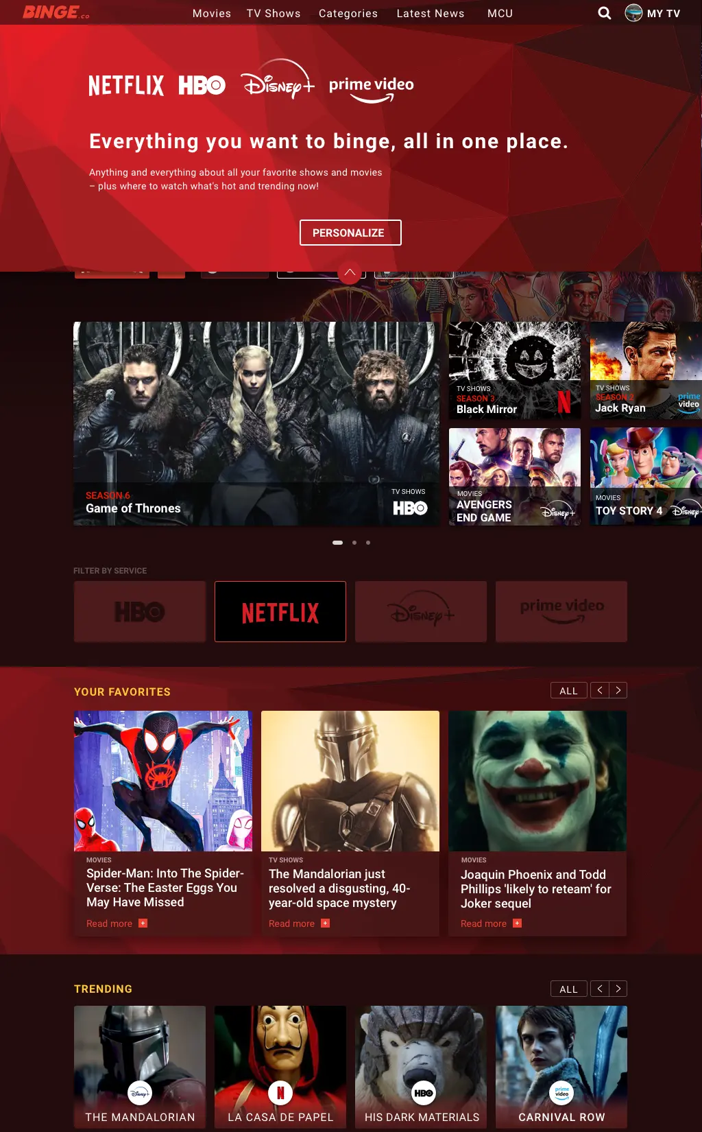
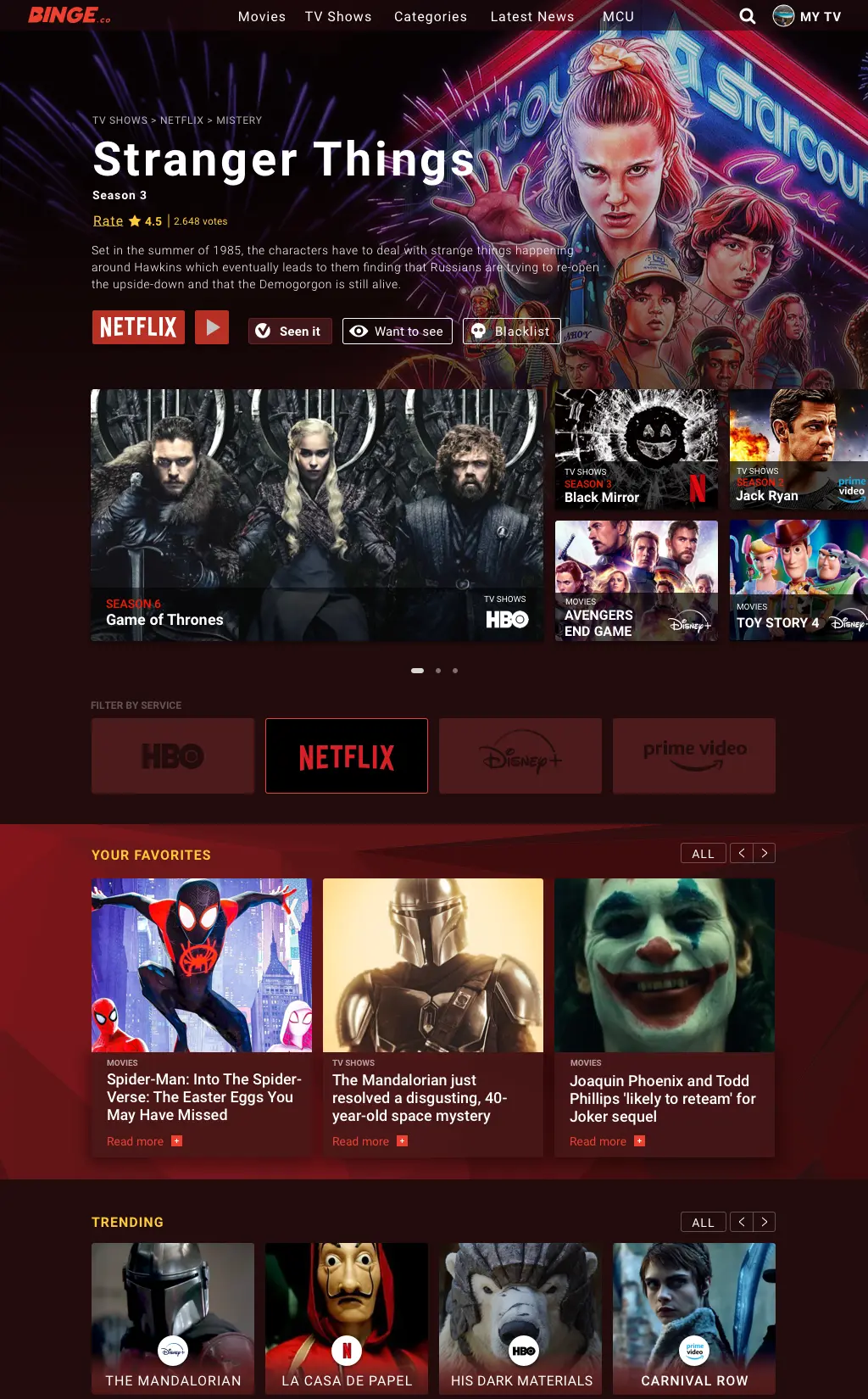
Design Decisions: Netflix is the best-known streaming platform in the market, and the red color has a direct association with streaming. So we decided to use a dark red color range to take advantage of this user perception and add a polygonal texture to have our own personality and differentiate our product.
Movies and TV shows have a very strong visual component, so we needed to make the most out of images, and we used them as a background to mimic the immersive sensation almost every cinema theater has.
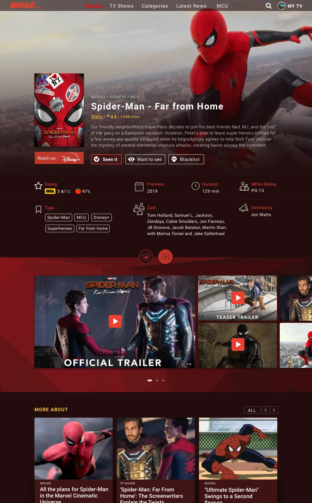
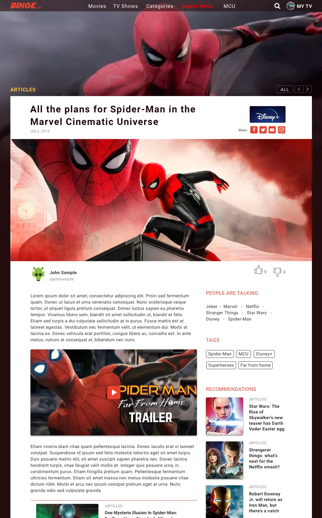
To fit articles pages in a visual world was a challenge in terms of design. We need to merge two different needs and change the user’s state of mind when going from the movie or TV show page to the articles page. For doing that, we created a page of editorial content framed in the cinematic look and feel that defines the entire product. In this way, we managed to locate the user in an editorial environment but without losing Binge’s own identity.
THE COLLECTION PAGE
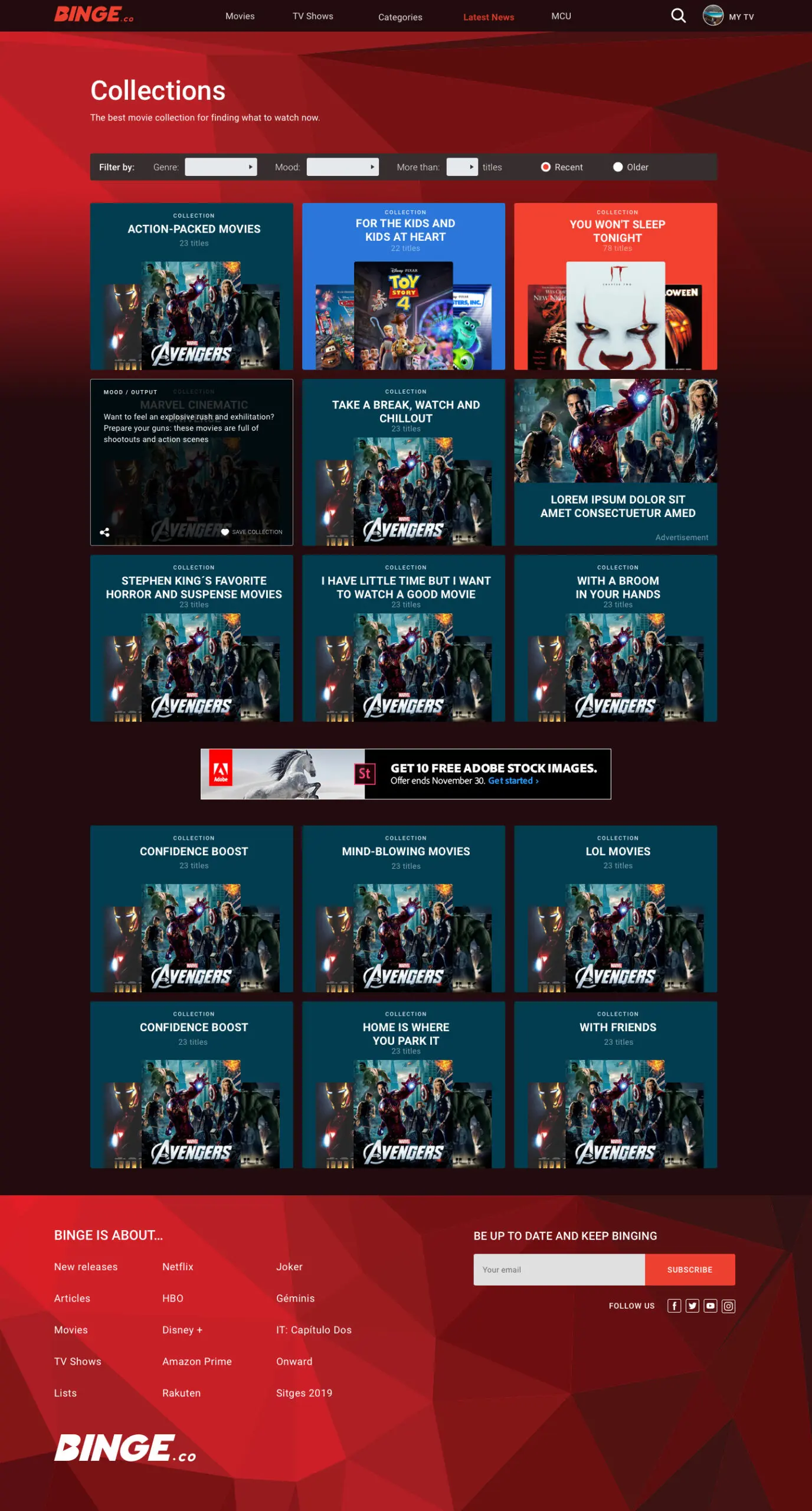
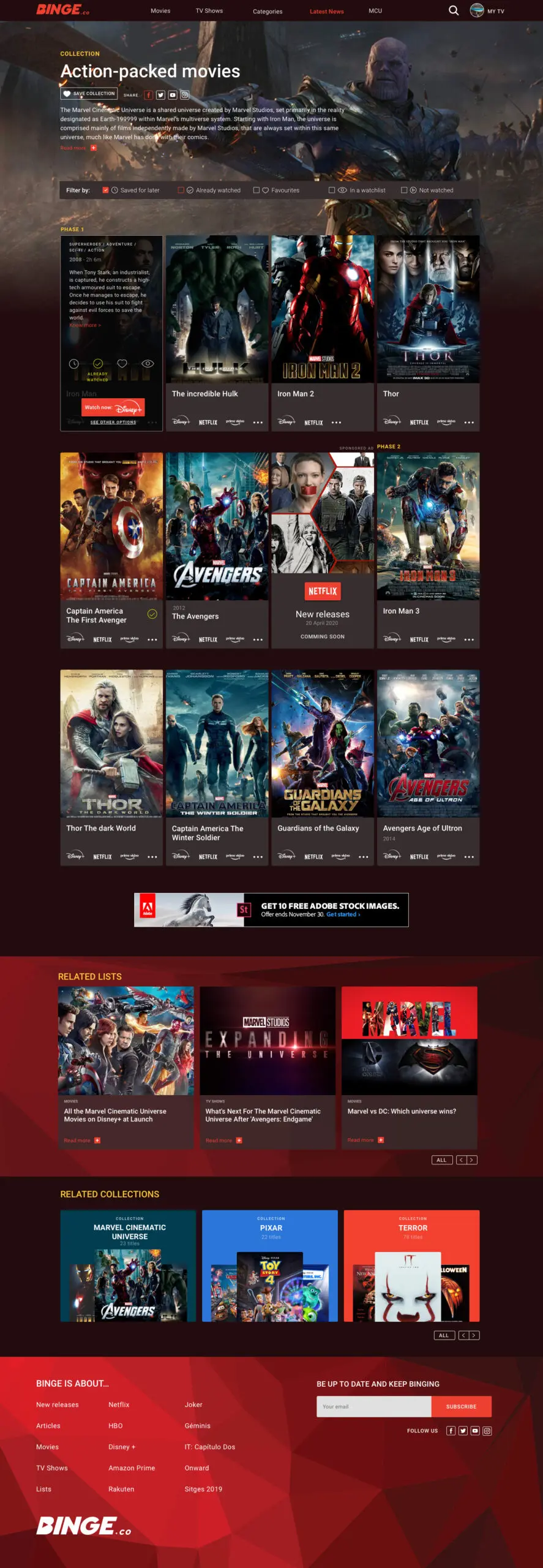
One of the most important pain we find out was very upsetting for the users, was losing so much time when looking for the movie or TV show they would like to watch, so we create the Collection Page to make this struggle easier and we wide brainstorm about all the features this section may have to succeed.
We were very clear that, as in the episode card of the movie / TV show, we needed to show more information and options than just the main image. So we decided to use a flipping effect on hover – in front, we displayed the main image, title, and streaming platforms where they were available. In the back; the rest of the information such as the plot, the labels, the buttons to select if it is an episode or movie already seen, add to the watch list, to the black list and to favorites, and a list of platforms where it is available with a pre-selected featured option.
We found this differentiation very important for users, so we added a filter bar to make the watching decision easier.
LEARNINGS
- To build a successful product, you can always follow your intuition, but if you try to understand the customer before starting, it increases notoriously your chances of success.
- When a team works focused on a project they love, you achieve incredible and unexpected results.